Choose the best type of graph
key notes:
1️⃣ Bar Graph 📊
- Shows comparison between different groups.
- Use when you have categories like fruits, animals, or students’ favorite colors.
- Bars can be vertical or horizontal.
- Example: Favorite ice cream flavors 🍦 (chocolate, vanilla, strawberry).
2️⃣ Line Graph 📈
- Shows changes over time.
- Use when you want to see trends (increasing or decreasing).
- Points are connected by a line.
- Example: Temperature 🌡️ over a week.
3️⃣ Pie Chart 🥧
- Shows parts of a whole.
- Use when you want to show percentages or fractions.
- The circle is divided into slices 🟦🟧🟪.
- Example: Time spent on activities in a day ⏰ (sleeping, studying, playing).
4️⃣ Pictograph 🖼️
- Uses pictures or symbols to show data.
- Each picture represents a certain number of items.
- Easy and fun to understand!
- Example: Number of pets 🐶🐱 owned by students.
5️⃣ Tips to Choose the Best Graph 💡
Ask yourself:
- Is it comparing categories? → Bar Graph
- Is it showing trends over time? → Line Graph
- Is it showing parts of a whole? → Pie Chart
- Is it showing numbers with pictures? → Pictograph
Always label the graph clearly 🏷️.
Use different colors 🌈 to make it easy to read.
Learn with an example
1) Which type of graph would best show the number of sit-ups each fourth-grade student can do?
- stem-and-leaf plot
- bar graph
- pictograph
- The best type of graph to show the number of sit-ups each fourth-grade student can do is a stem-and-leaf plot. It shows the numbers in a large data set arranged by place value. Example:
| Points per game | |
| Stem | Leaf |
| 0 | |
| 1 | 0 1 2 2 4 9 9 |
| 2 | 2 9 |
| 3 | 0 1 2 |
| 4 | 0 4 |
| 5 | 2 2 4 6 |
| 6 | 1 1 1 1 4 8 |
- The other types of graphs are not as good.
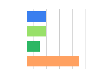
A bar graph compares two or more values. Example:
Class size
- A pictograph compares two or more values that are multiples of a number. Example:
| Reading competition results | |
| Zachary | |
| Alexis | |
| Gina | |
| Brandon |
| Each | = 2 books |
2) Which type of graph would best show the number of flowers planted at each school in the state?
- bar graph
- stem-and-leaf plot
- pictograph
- The best type of graph to show the number of flowers planted at each school in the state is a stem-and-leaf plot. It shows the numbers in a large data set arranged by place value. Example:
| Participants per race | |
| Stem | Leaf |
| 11 | 1 |
| 12 | 5 |
| 13 | |
| 14 | 3 |
| 15 | |
| 16 | |
| 17 | 0 5 |
| 18 | 2 3 7 |
- The other types of graphs are not as good.
- A bar graph compares two or more values. Example:
- A pictograph compares two or more values that are multiples of a number. Example:
| Kilometres run | |
| Carmen | |
| Emmy | |
| Zane | |
| Wesley |
| Each | = 5 kilometres |
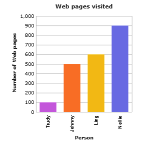
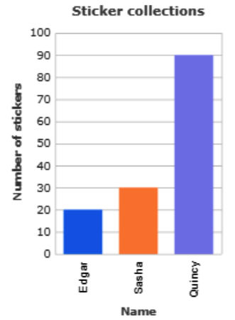
3) Which is the best type of graph to show the number of tickets sold for five different films?
- stem-and-leaf plot
- bar graph
- The best type of graph to show the number of tickets sold for five different films is a bar graph. It compares two or more values. Example:
- The other types of graphs are not as good.
- A stem-and-leaf plot shows the numbers in a large data set arranged by place value. Example:
| Articles per magazine | |
| Stem | Leaf |
| 0 | 6 |
| 1 | 0 5 |
| 2 | 2 3 |
| 3 | 2 8 |
| 4 | 5 6 |
Let’s practice!🖊️